I am currently working on this page to showcase my work. In the meantime visit my portfolio site: margotmafra.com to see more.
If you notice that there isn’t a distinctive style, thats the point.
The work that I create is curated specifically to my clients. Some are maximalist, some are minimalist, some prefer bold, others prefer muted, some love illustration, others don’t.
While I bring the ideas and concept directions, I always keep my clients’ taste front of mind.
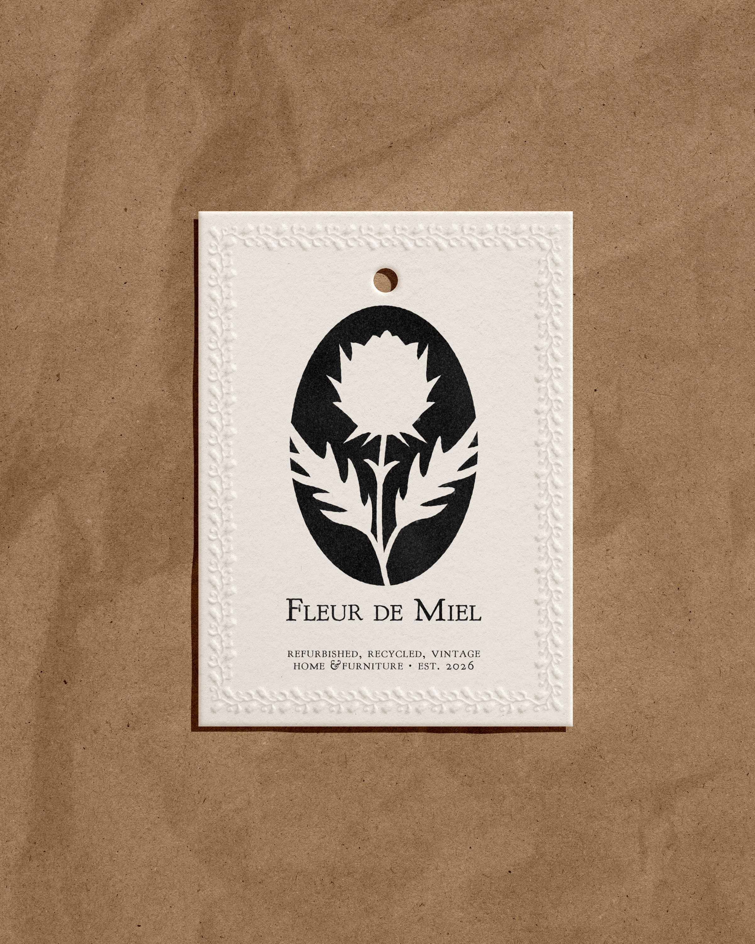
FLEUR de MIEL
The Logos: Because a brand needs to function in the real world, we built a suite that can be used in many contexts. Fleur de Miel has several lines of products with different logo needs. For example, the bold thistle stamp is perfect for a rugged ink brand on the underside of a raw wood chair, whereas the elegant, sweeping script would be used on the woven fabric tag of a luxury pillow.
The Motifs: The owner loves wildflowers but has a little more spunk than a poppy or a daisy, so Thistles and Bees became the brand’s motifs, which are elegant and beautiful, with natural defense mechanisms like the thistle’s sharp, spiked leaves, or the bee’s stinger. These motifs combined with the soft, sweet, elegant name Fleur de Miel (Honey Flower) creates an intentional duality, which is what the brand is built off of by mixing modern and vintage in their craft.
The Typography: Inspired by vintage French apothecaries, storefronts and antique estate seals, we paired elegant, flowing French script with a slightly weathered serif font.
Past Home & Lifestyle Projects
Fleur De Miel
Sharp, yet sweet, Fleur De Miel is a vintage home brand that gives a modern touch to vintage finds.
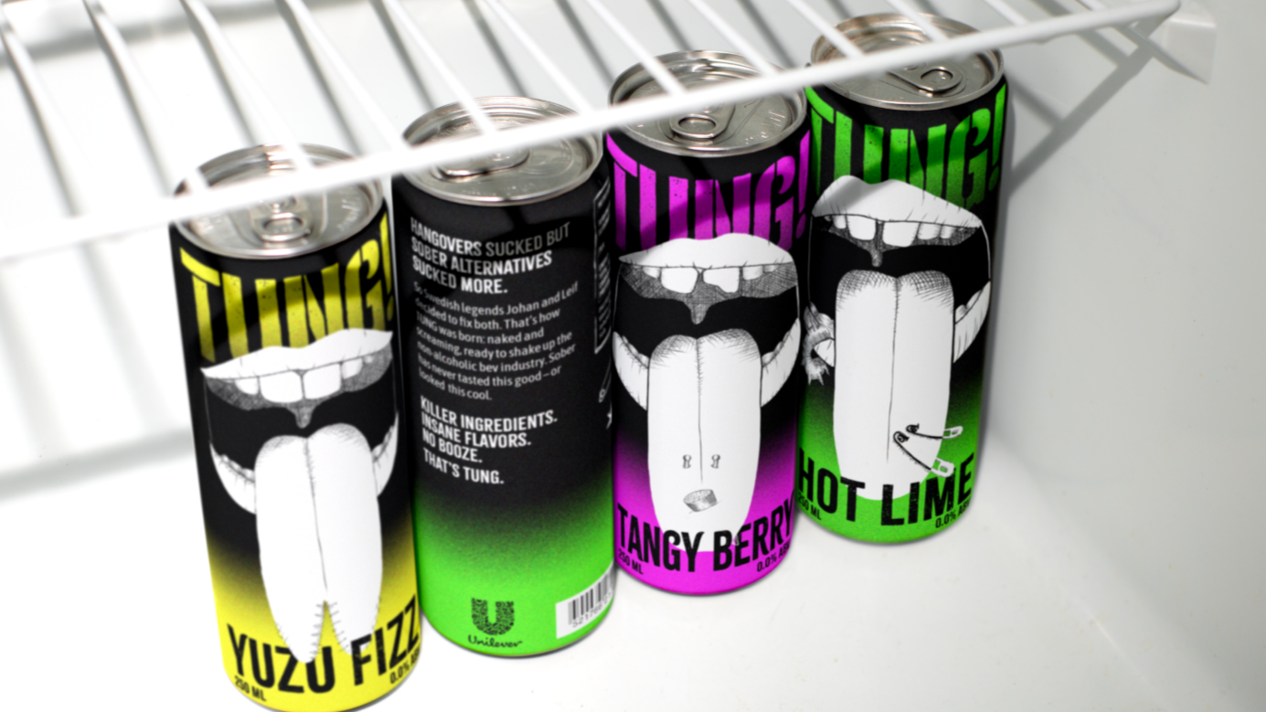
Tung
A sober alternative for the people who make fun wherever they are.
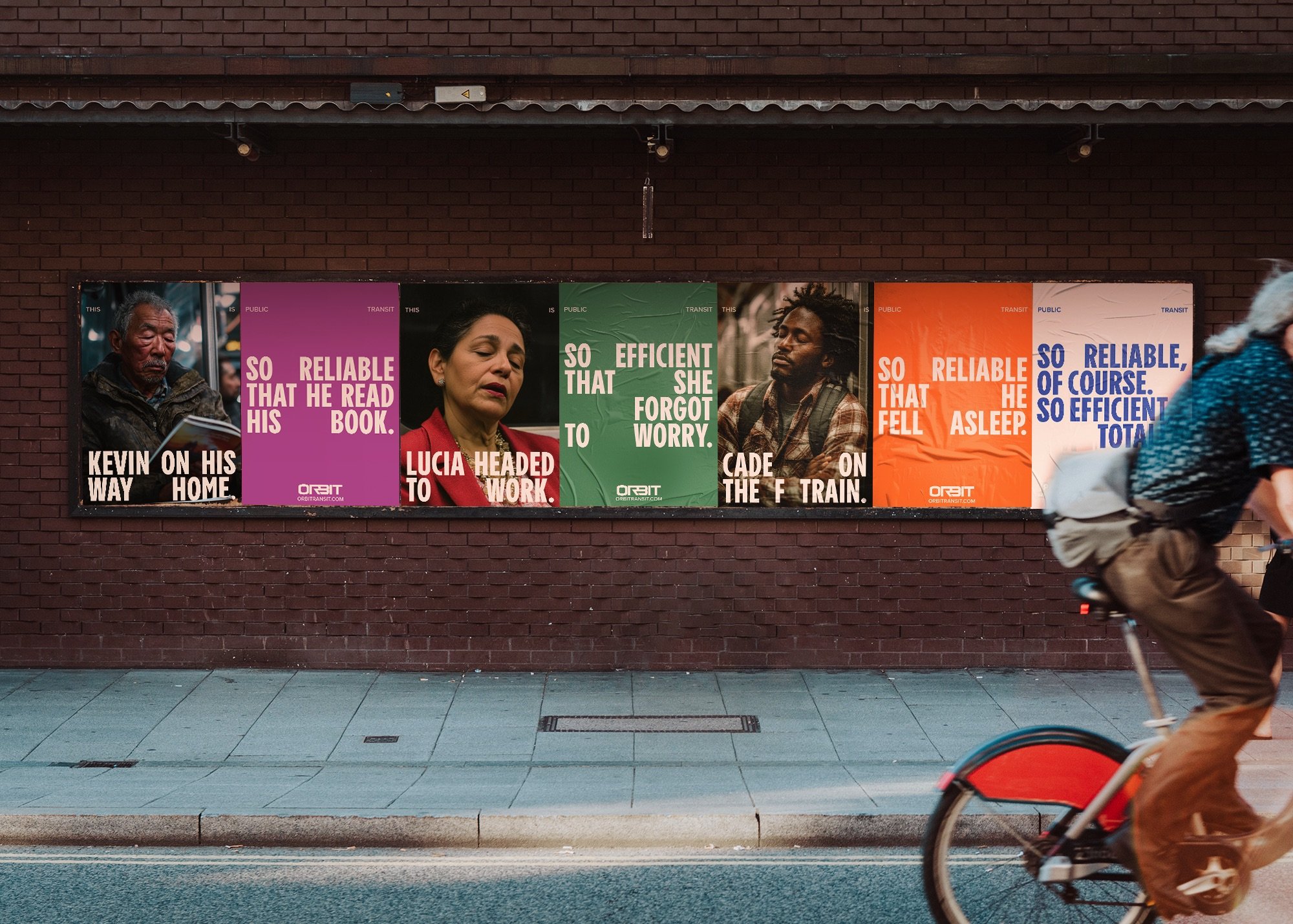
Other projects that I’m proud of
Not necessarily home and lifestyle, but still good work.
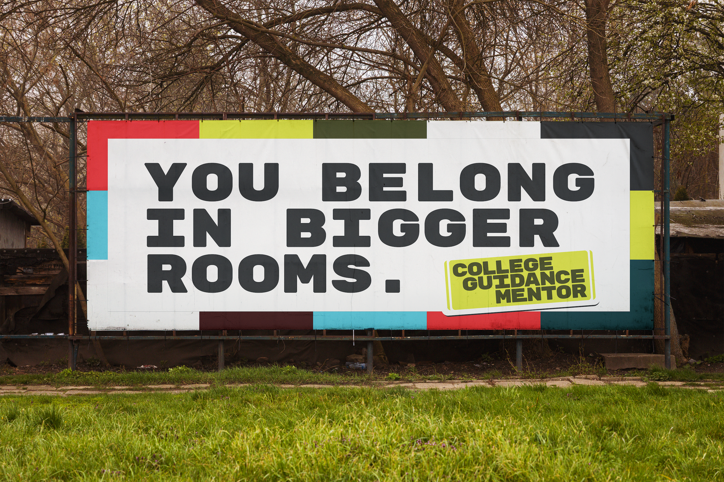
College Guidance Mentor
An after-school college mentoring program for high-schoolers in Los Angeles.